Install and get start Storybook
2 min readAug 1, 2022

Install And Run
First, we need a react.js base application. In there we can install storybook.
Install
npx sb initRun
npm run storybookAfter this short code we can check our first Storybook controller in our app.
Set Components
first we need to make component that you want to use. For me I want to make Button.tsx component.
export interface ButtonProps {  handleClick: () => void;  label: string;  size: "sm" | "md" | "lg";  backgroundColor: string;  color: string;}function Button({

  label,  backgroundColor = "red",  size = "md",  handleClick,  color,}: ButtonProps) {  let scale = 1;  if (size === "sm") scale = 0.75;  if (size === "lg") scale = 1.5;  const style = {    backgroundColor,    padding: `${scale * 0.5}rem ${scale * 1}rem`,    border: "none",    color,};return (  <button onClick={handleClick} style={style}>    {label}  </button>);}export default Button;
Set Stories
After set components what we want to use , and then we can set stiries.tsx file. Let’s create a story corresponding to Button.tsx. I will name it Button.stories.tsx.
import Button, { ButtonProps } from "../components/Button";import { Meta, Story } from "@storybook/react";export default { title: "Button", component: Button, argTypes: {clickHandler: {action: "clicked"}},} as Meta;const Template: Story<ButtonProps> = (args) => <Button {...args} />;
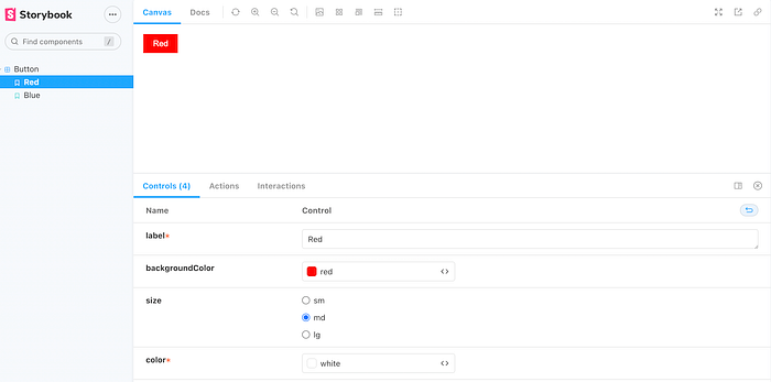
export const Red= Template.bind({});Red.args = { label: "Red", backgroundColor: "red", size: "md", color: "white",};
If you want to add Blue Button Component than add variable.
export const Blue = Template.bind({});Blue.args = { label: "Blue", backgroundColor: "blue", size: "md", color: "white",};
After all this we can see our code in Storybook Browser.
Like this ~


